
Overview
What started as a week-long alpha sprint turned into something I didn't expect — an ongoing design evaluation that's still running.
The community sessions, the FigJam board, the feedback loops — all of it continued well past the alpha. The UI redesign concepts were scoped to the alpha build, but the UX and interaction analysis kept pace with every major release milestone, right up to launch.
20+ Contributors | 100+ Design Insights | 10+ Interface Redesigns
Updated: As Bungie moved through ViDoc drops, a pre-launch server slam, and the full release, so did this project. It's a living document — and honestly, given where Marathon is headed, probably staying that way.
Role
Community Project
Team
20+ Feedback contributors
1x Designer (me)
Year
2025-26
Process
Origins
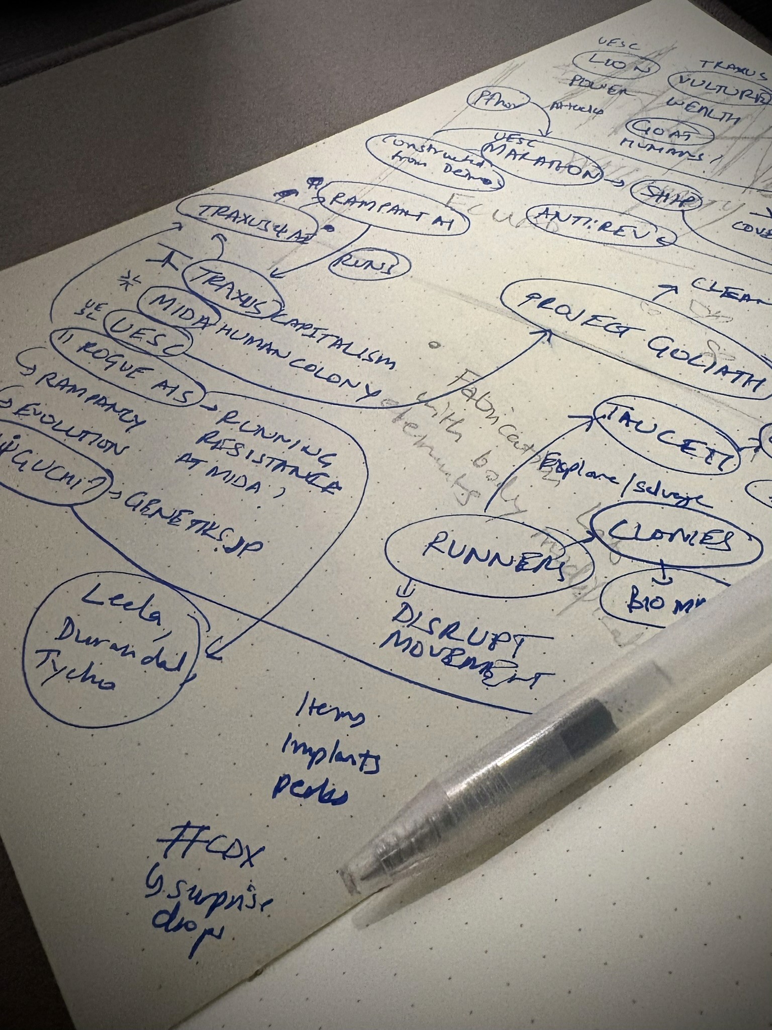
When Marathon's alpha gameplay dropped in April 2025, the lore nerd in me had already spent hours deep in the archive—connections, references, rabbit holes. But this time, I wanted to contribute, not just consume.
The problem was clear
The alpha UI showed promise but had friction. Inconsistent navigation, accessibility gaps, and genre-specific features that didn't align with extraction shooter conventions—more like they were trying to redefine the genre.
Building the Evaluation Framework
UX is better with a bit of co-op. I opened the FigJam board to the community across Discord and Reddit feedback channels, hosting four open sessions during that first week-long sprint. Rather than dumping people onto a blank canvas, I built out a structured interaction map using 50+ game screenshots so the contributors could actually anchor their thoughts to.
Four colour-coded categories to keep inputs organised and actionable:

From alpha to full release — how the scope evolved
The alpha sprint had a defined endpoint. The project didn't.
As Bungie released ViDoc, the pre-launch server slam, and the full game, it made sense to keep the evaluation going. The newer sessions on the board are more structured: screenshots are positioned and connected by user flow (menu → pre-run → in-run → post-run) with colour-coded insights mapped directly onto the screens, making it much easier to trace where specific friction lives.

Over 100 sticky notes, endless Discord threads, and genuinely great discussions later — the reception was better than I expected:

Compiling insights — Alpha UI
Within the first week of the sprint, three core issue areas surfaced clearly from the alpha:
Navigation & menu architecture |
|---|
Design consistency, scalability & accessibility |
Genre-specific feature adjustments |
Given no first-hand alpha access, the scope was kept honest:
Executable improvements vs. moon-shot concepts |
|---|
Key screens vs. screen states |
Contents within gameplay footage vs. discussion threads |
Design improvements (Alpha UI)
Working with salvaged assets from footage, I rebuilt enough of a design system to redesign key interfaces. Some may look slightly rough at the edges due to asset limitations, but the thinking is sound.

Main Menu + Navigation
Consolidated the main menu and lobby screen to reduce redundancy + common interface practices in extraction shooter games

Runner Overview
Readjusted the layout and design to scale for future runner additions + upfront ability overview

Factions (Upgrades + Contracts)
Optimized UI by reducing the number of clicks to reach important pieces + layout exploration

Map
Adjusted the map UI to be consistent with the design + space efficient

HUD + Mini-map
Tweaked for design consistency + accessibility + added minimap UI to offload pings from cluttering the screen
Outcome
The alpha sprint output was a clear deliverable — 10+ redesigned interfaces addressing 20+ pain points across six key areas. That part is done.
The evaluation isn't.
As Marathon continues to patch, season, and expand, this project runs alongside it. This has become less of a case study and more of a running record of what it looks like to think carefully about a game's design as it evolves in public.
My roadmap stays the same: refine the insight process, keep contributing to the community dialogue, and maybe — eventually — get this in front of the people actually building it. (Hire me, Bungie. 👀)
Want to geek out about it? Reach out! 🎮