MOOD-BORED
IXD / 2022
STUDIO / PRINT MEDIA / PSYCHOLOGY / RESEARCH / BOREDOM / CASE STUDY
OVERVIEW
"Mood Bored" is a design experiment that emerged from a desire to combat creative stagnation. It explores how seemingly mundane and uninspiring states of mind can be navigated through a timeless medium. This project culminated in a playful and introspective visual experience that reflects the unpredictability of creativity through a zine.
GOALS
- Explore boredom as a catalyst for creativity.
- Use existing mediums to help humans navigate in and out of boredom states.
- Encourage others to embrace their creative process, even during uninspired phases.
RESEARCH
TARGET AUDIENCE
Individuals in creative fields—designers, artists, writers—who often experience lulls in inspiration. It also appeals to a broader audience interested in digital art and self-expression.
For this pilot, the target audience was confined to students and professors of ECUAD.
METHODS
Informed by the innovative perspectives of Sara Hendren's "newly visible" design approach and Craig Martin's "deviant" design philosophy, the research process for "Mood Bored" was driven by a blend of ethnographic and phenomenological methods. These approaches allowed for an in-depth exploration of the audience's relationship with boredom, while maintaining a casual and approachable inquiry process.
Research Inspiration
Sara Hendren: Focus on making the invisible visible, particularly in design contexts that reveal overlooked or mundane aspects of life.
Craig Martin: Emphasizes unconventional or "deviant" design that challenges normative assumptions and encourages creative thinking.
Unstructured Focus Group
Conversations were initiated informally during casual gatherings, such as coffee table discussions. The goal was to organically introduce the topic of boredom, leading participants to naturally share their experiences and perceptions.
Structured Surveys
Building upon the discussions from the focus groups, surveys were designed to refine and direct the data collection towards specific aspects of the topic. The surveys were structured to maintain a casual tone, ensuring participants felt comfortable.
- Age Group Identification: Understanding the demographic spread of the participants.
Productive Phases: Identifying times when participants felt most productive to contrast with moments of boredom. - Relation to Boredom: Exploring feelings and activities associated with boredom.
- Boredom and Anxiety: Investigating whether boredom induces anxiety among participants.
- Emoji Collection: Collecting participants' visual representations of boredom through emojis, offering insights into their perception of this state.
- Boredom Triggers: Identifying factors that might trigger boredom.
- Coping Mechanisms: Exploring current strategies participants use to deal with boredom.
- Cultural Perspectives: Understanding how "being bored" is interpreted across different cultural backgrounds within the diverse cohort.
Interactive Posters
Posters were placed on premises frequented by the target audience, accompanied by post-its and prompts. The audience was encouraged to contribute their thoughts and ideas anonymously.
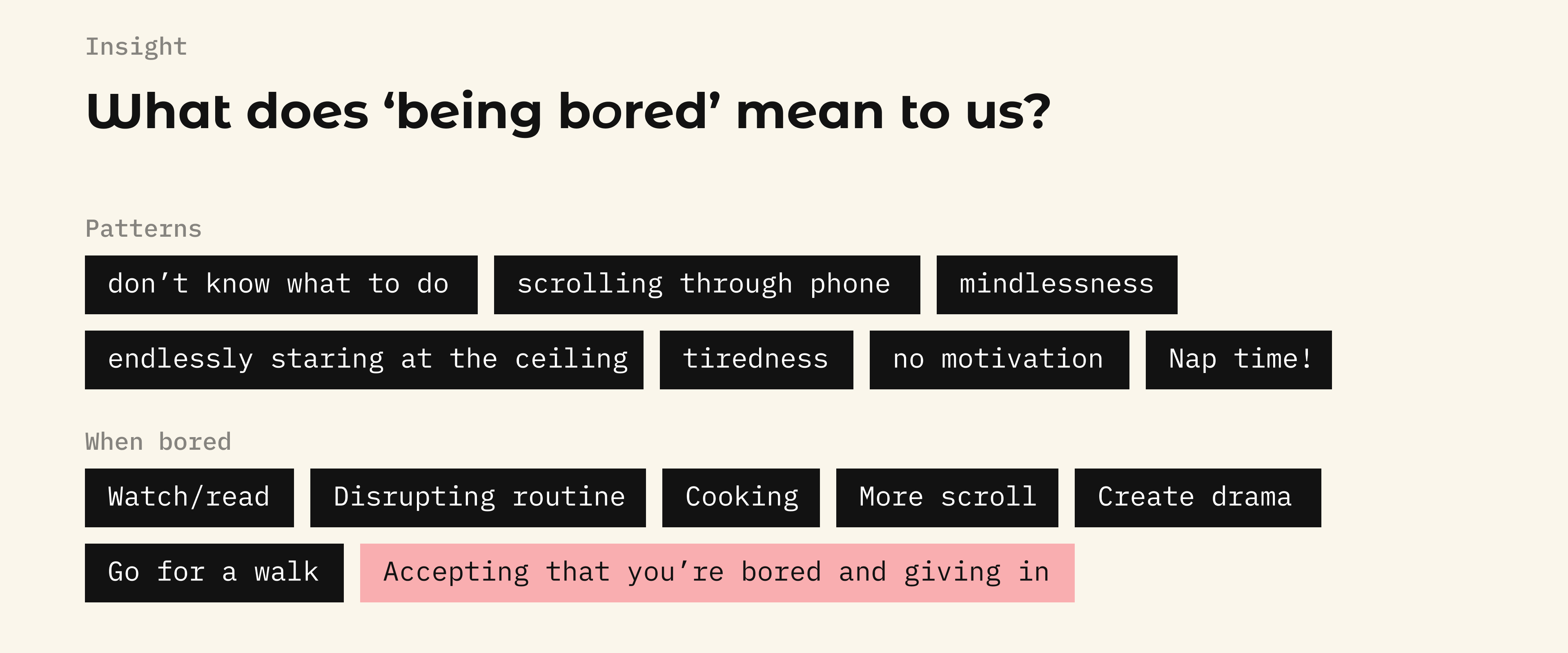
Structured surveys revealed clear patterns in how boredom is experienced, with creatives often turning to simple, disruptive activities like cooking or taking walks to reset their minds. Informal discussions added depth, uncovering personal stories and varied coping strategies that highlighted the emotional aspects of boredom.
A significant realization was the importance of accepting and being aware of boredom; those who acknowledged it were better able to use it creatively. This led to a strategic shift from trying to "fix" boredom to embracing it as a natural part of the creative process, turning it into a catalyst for creativity and self-expression.
DESIGN EXPLORATIONS
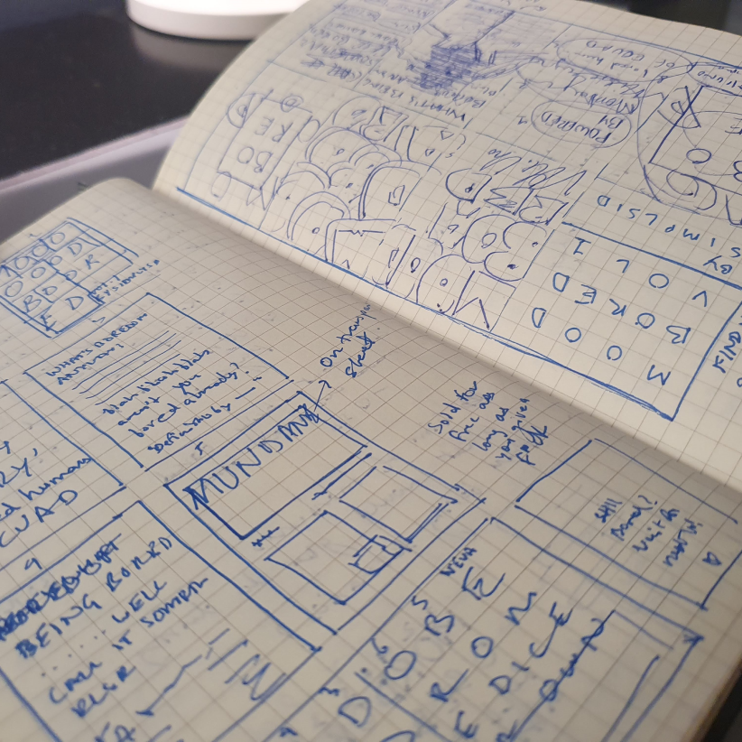
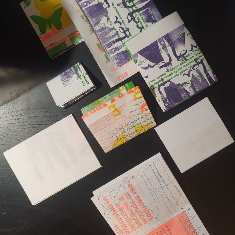
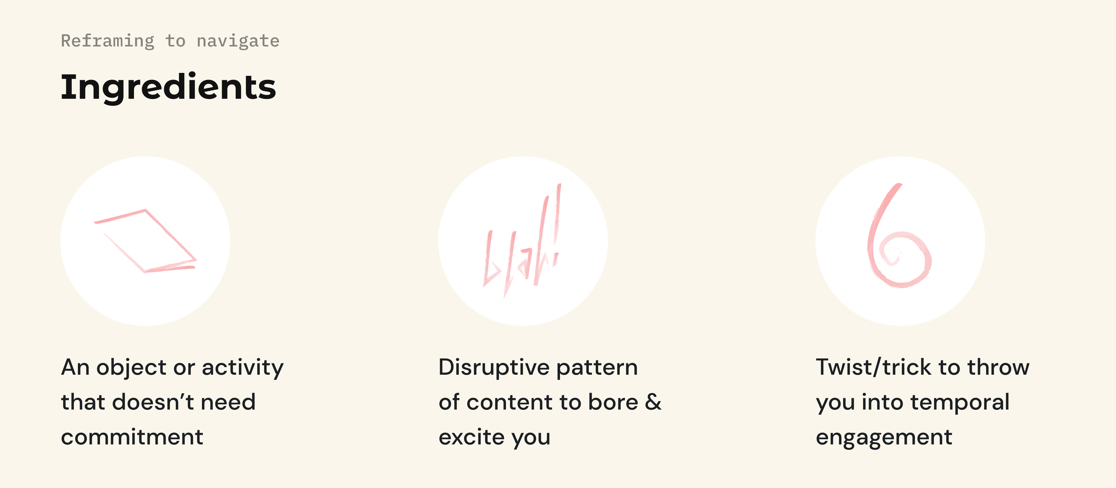
Designing something analogous in the digital era poses its own risk, but in this case, fits perfectly as a disruptive element in our daily lives as creatives. The medium was decided as I took a phenomenological approach to rethink the possibilities. Going back to the roots where magazines were not just a source of information but also entertainment. They came with their own personality, evoking a sense of curiosity among the readers, deviant in their own manner. However, reframing boredom was not a problem but just a flip of perspective that was required. Several factors listed below shed light on an effective medium fit to bring about a micro-hiccup in our busy lives, a 'zine':
- Bite-sized
- Relatable
- Mellow
- Feel normal
- Engaging yet not requiring much attention
- Meaningful
TRANSLATING THEMES INTO CONTENT
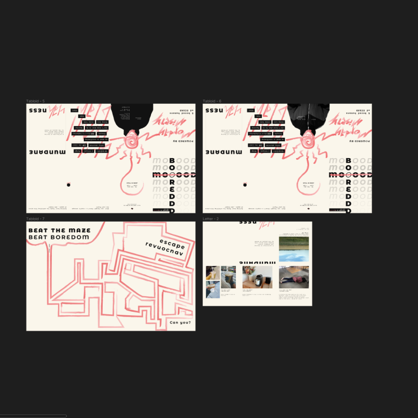
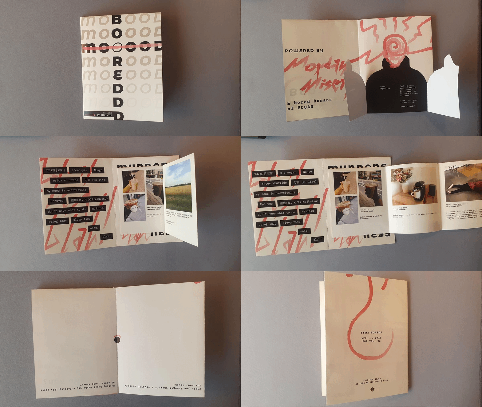
As a result of the research and concept exploration, it made sense to include the community in the mix. Thus, the structure of the zine contains the following to make it feel like a roller-coaster ride aka a smooth curve in the user's journey through the content:
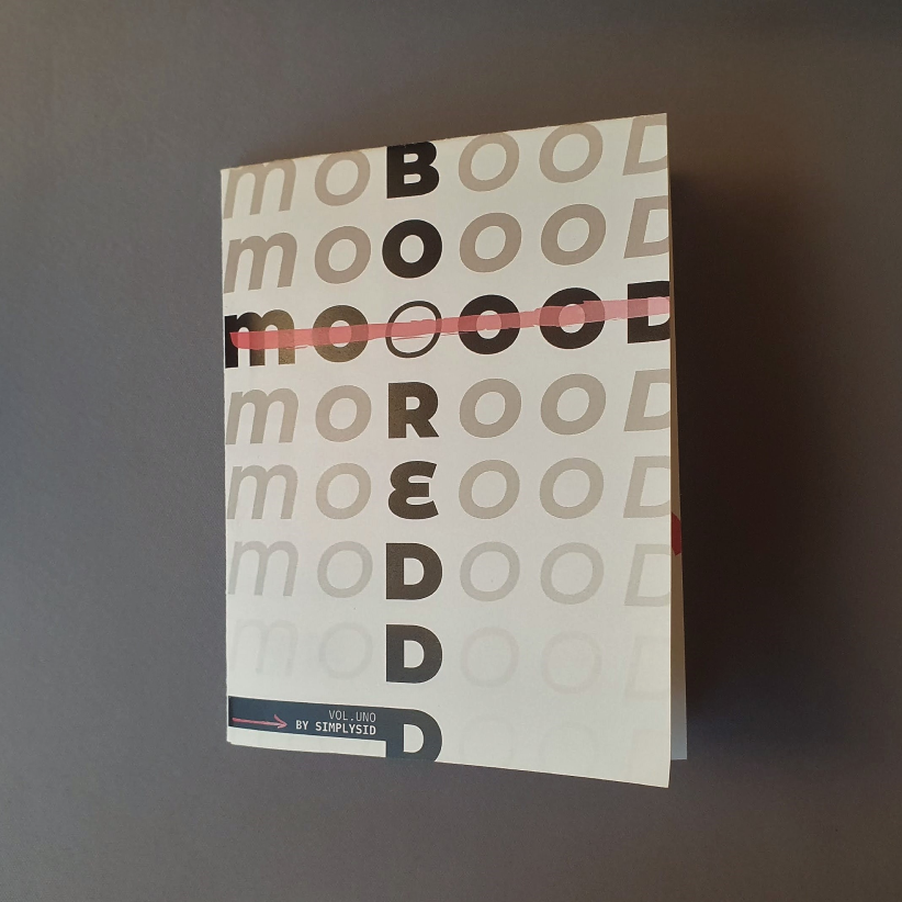
- Catchy cover and title
- Acknowledgement for inspiration
- A visual metaphor for boredom via a chaotic portrait of a human
- Boredom through individual and diverse cultural lenses (various ways to mean "being bored")
- Community-curated photographs of mundane and boring frames of life submitted by the users (attached with story/context)
- A confusing blank page with a cryptic message to hook users into revealing a more engaging part of the zine
- Maze game upon the unfolding of the zine that unfolds their boredom, channelling their attention and curiosity into the mini-game before throwing them out to a conclusion - derived by themselves
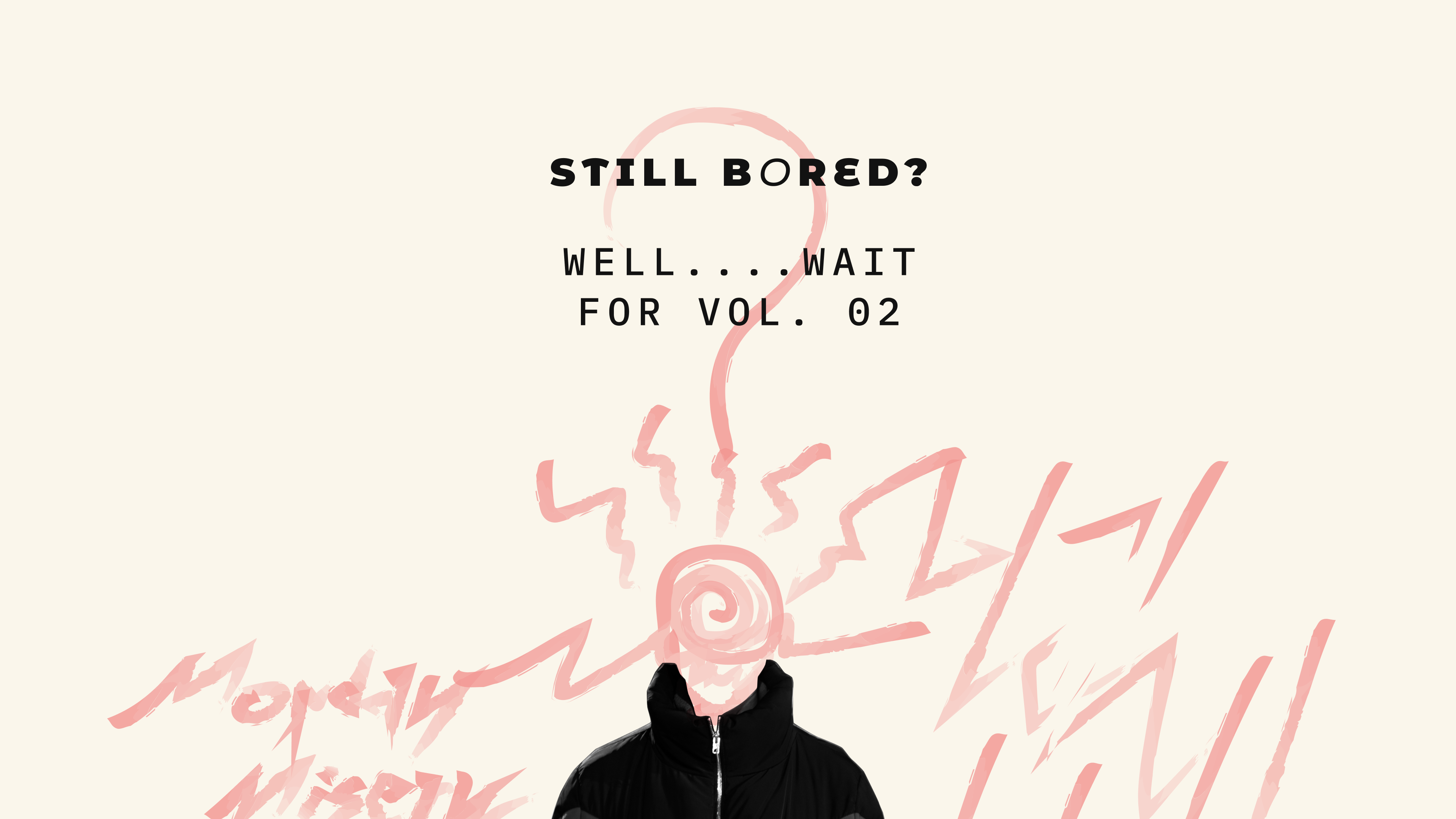
- The outro to the book/back cover reveals messaging to convey that the zine was designed with care and absolute curation to the needs
EXAM TIME! ZINE IN ACTION - CRITIQUE
NOTABLE REACTIONS
- This is so personal and reflective!
- I love the brush strokes across the whole zine, it gives the content a very organic vibe
- I can't relate to these photo captions enough!
- The maze was such an unexpected but worthy surprise, easy yet compelling to make you try it out
- How can one be bored after this? Need more games, more mood-bored
- Appreciate the effort to explore a completely different medium that feels completely thought-through for the situation
CONSTRUCTIVE FEEDBACK
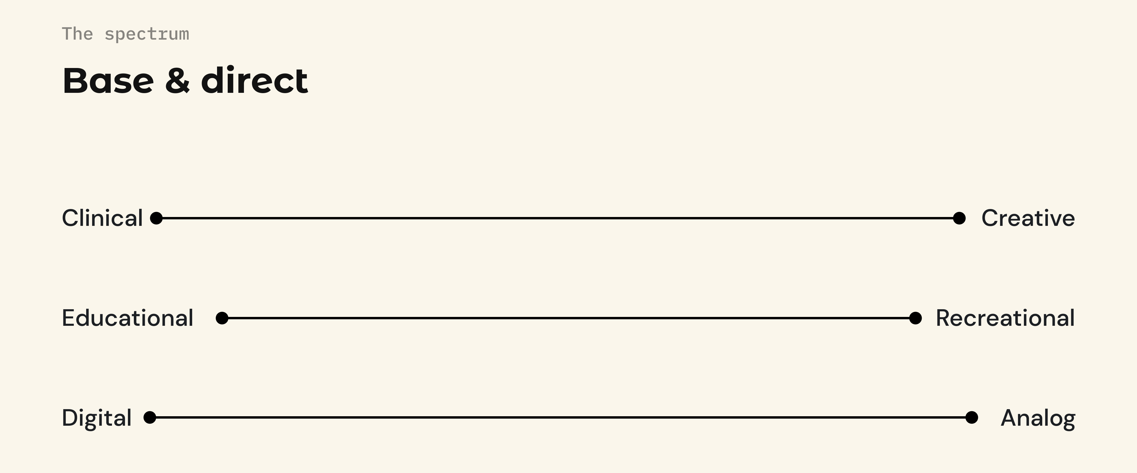
- Touching briefly upon the clinical side of it for the sake of education could be a factor to be considered. There is knowledge in diving deeper into this side of the study when expanding the horizons of the target audience or simply changing the context.
- Maze is fun! but could this also be other kinds of games? Sudoku maybe? There are a lot of ways to engage a mind, it all depends on what works for who. Finding a common activity that does not take a lot of commitment is not always easy yet an important aspect to experiment with.
THINGS COULD BE DIFFERENT! HERE'S TO FUTURE PROSPECTS
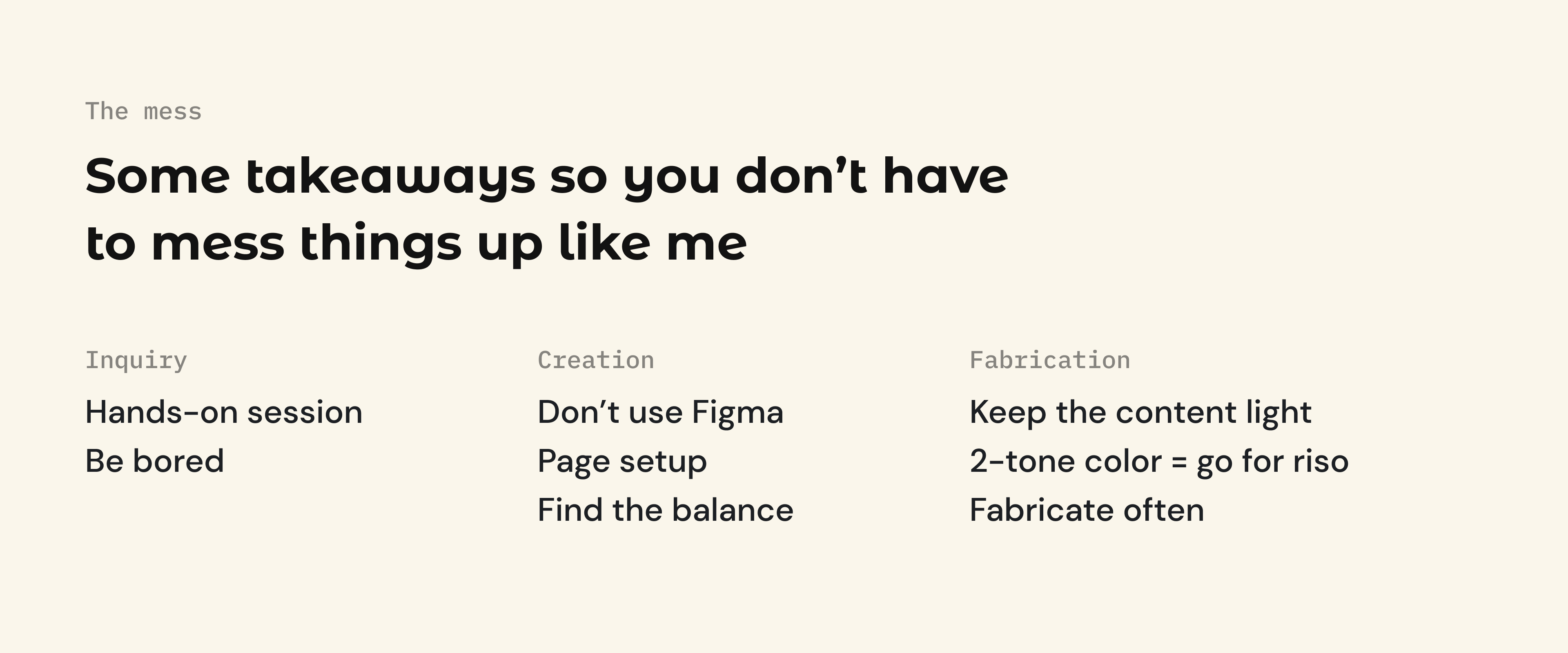
- Hands-on focus group to test more experiments - observing users through various types of boring situations, perhaps taking them through a boring activity would bring forth a lot more visceral data through expressions and reactions in real-time.
- Print tests with Risograph - richer colors on a unique print format can make a difference in the physical experience of the zine
- More variety of games and forms of engagement
- Volume 2.0 - make a publication already!
- The zine was one of the approaches that proved to be effective in reframing. However, it may not be the only one. When expanding the context and target audience, there is a plethora of opportunities to delve into. And I can certainly say, zines would not necessarily fit those needs. There's more!

 INSTAGRAM