
CUSTOMER PORTAL
UX / 2020-21
UX / RESEARCH / SUBSCRIPTION & SERVICES / ENGAGEMENT / MICRO-INTERACTIONS
OVERVIEW
A data visualization product (white labelled in this showcase) required a revamp of their customer portal that helps the user manage their licenses and users. The experience in the current state felt very isolated with no other elements to engage the user.
Based on a prioritization exercise, the architecture of the portal was restructured. Specific primary tasks were prioritized to surface in the first fold while the other exploratory features followed.
A product companion was introduced as a support experience to help users tailor their subscription items when they purchase. Additionally, too many scattered ways to manage keys and users were combined cohesively.
This phase of the project focused heavily on tech feasibility; hence, the designs needed to be less complex and easy to execute within their framework. Lastly, another phase of a blue-sky exercise was conducted to envision industry-standard possibilities for customer expression, conversion and engagement.
TARGET AUDIENCE
SMALL SCALE FIRMS
More popular user-base, particularly students and other individuals. Majorly utilizing single key license to operate.
LARGE ORGANIZATIONS
These can scale from multiple subscriptions (each can have multiple keys) to multiple portal accounts dealing with multiple subscriptions each.
PROCESS
KEY METRICS
Identified based on a preliminary heuristic evaluation conducted on the website. Pain points were overarching through various areas (first impressions content, trial process, conversion, etc.)
COMPETITORS LANDSCAPE ANALYSIS
Results found PrimRose (the data viz product) had a bounce rate of 49.66% compared to the others under 41% and lacked elements of engagement. Their pricing strategy was quite complicated to understand and relied on representative lead generation.
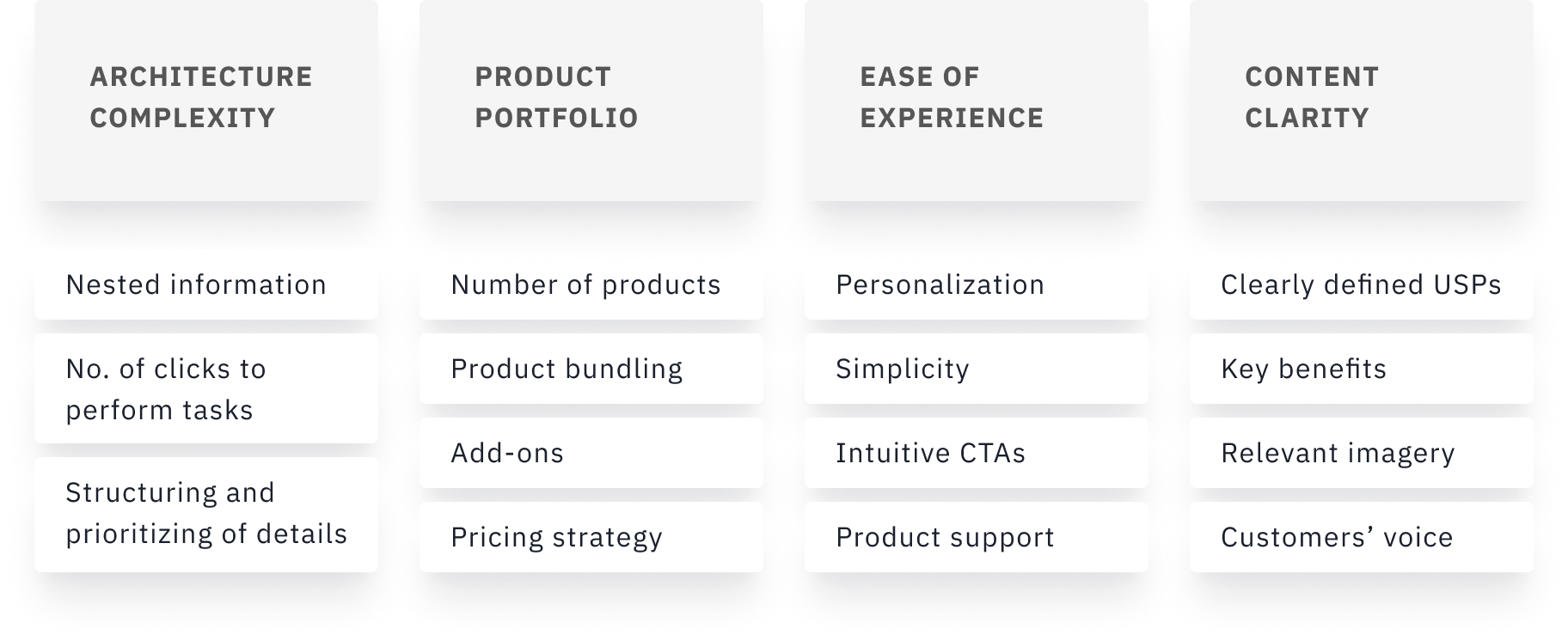
DESIGN PRINCIPLES
Combination of feature set and evaluation metrics, forming 3 pillars for design to drive the process forward.

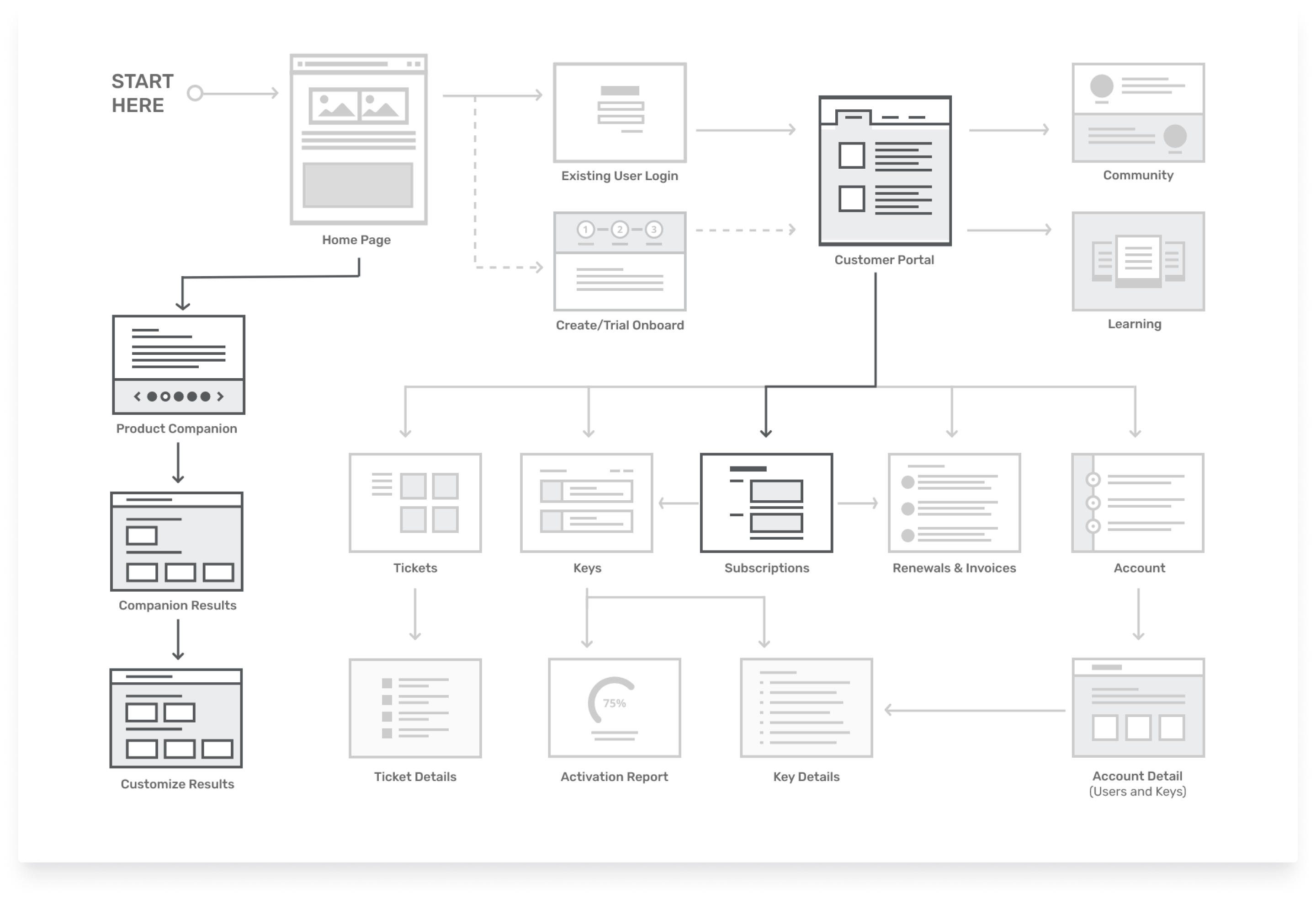
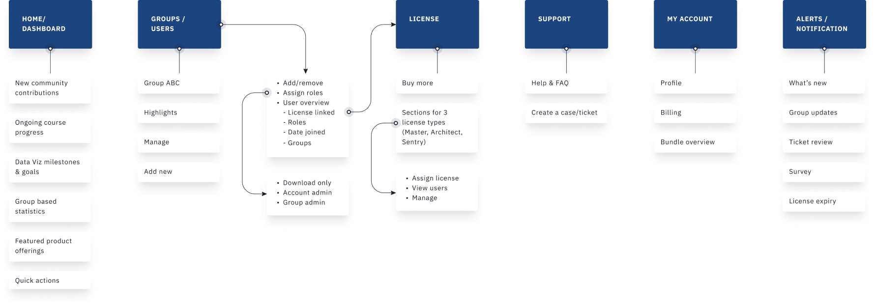
ARCHITECTURE
Highlighted elements were covered within the scope of this project while a vision exercise was conducted later for a few others (not available for disclosure)
EXPLORATIONS
The main agenda behind the final layout is to give the right mix of information (as per the client's requirement) while keeping the portal lightweight. Other explorations were showcased as variants.
FEATURE BREAKDOWN
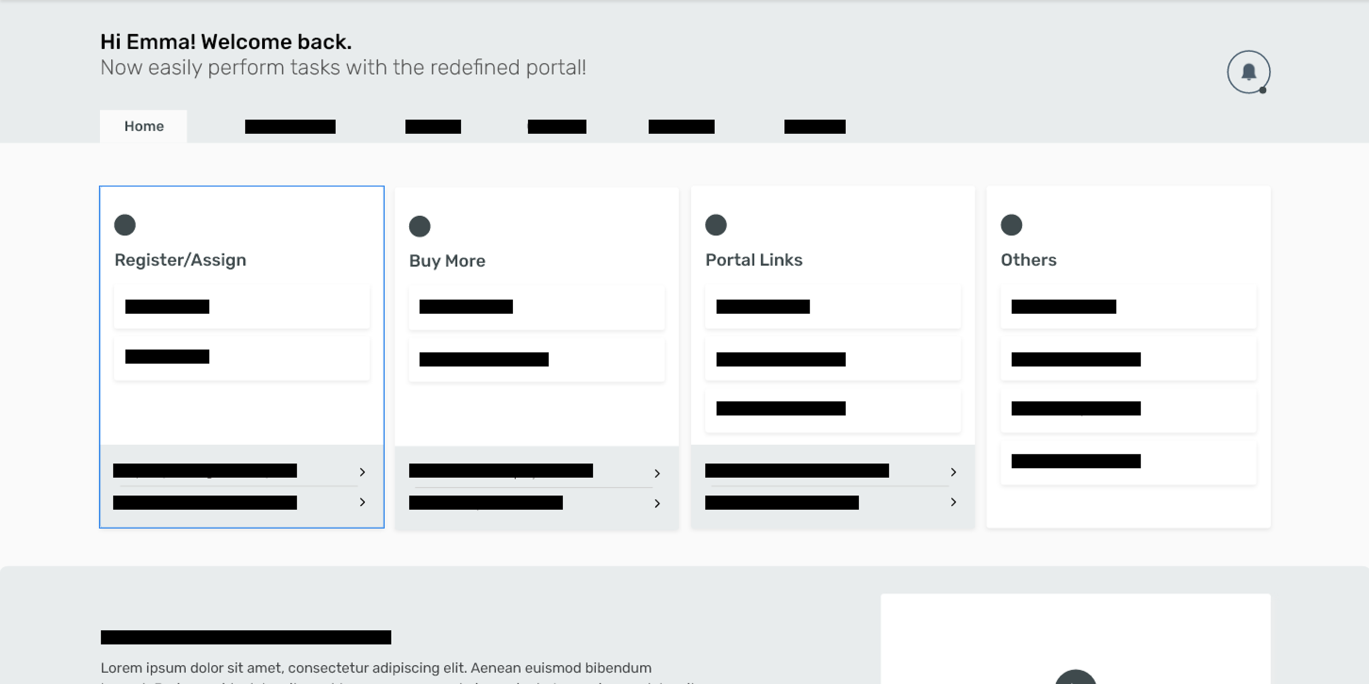
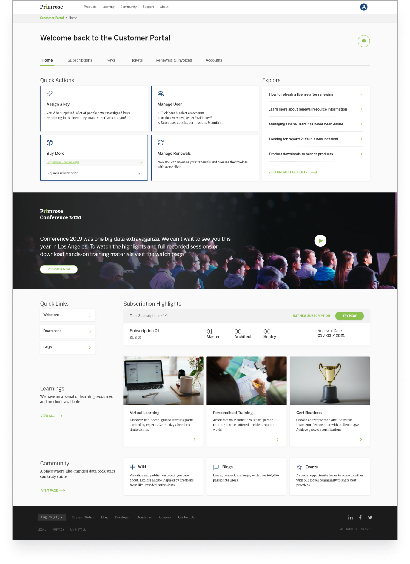
CUSTOMER PORTAL
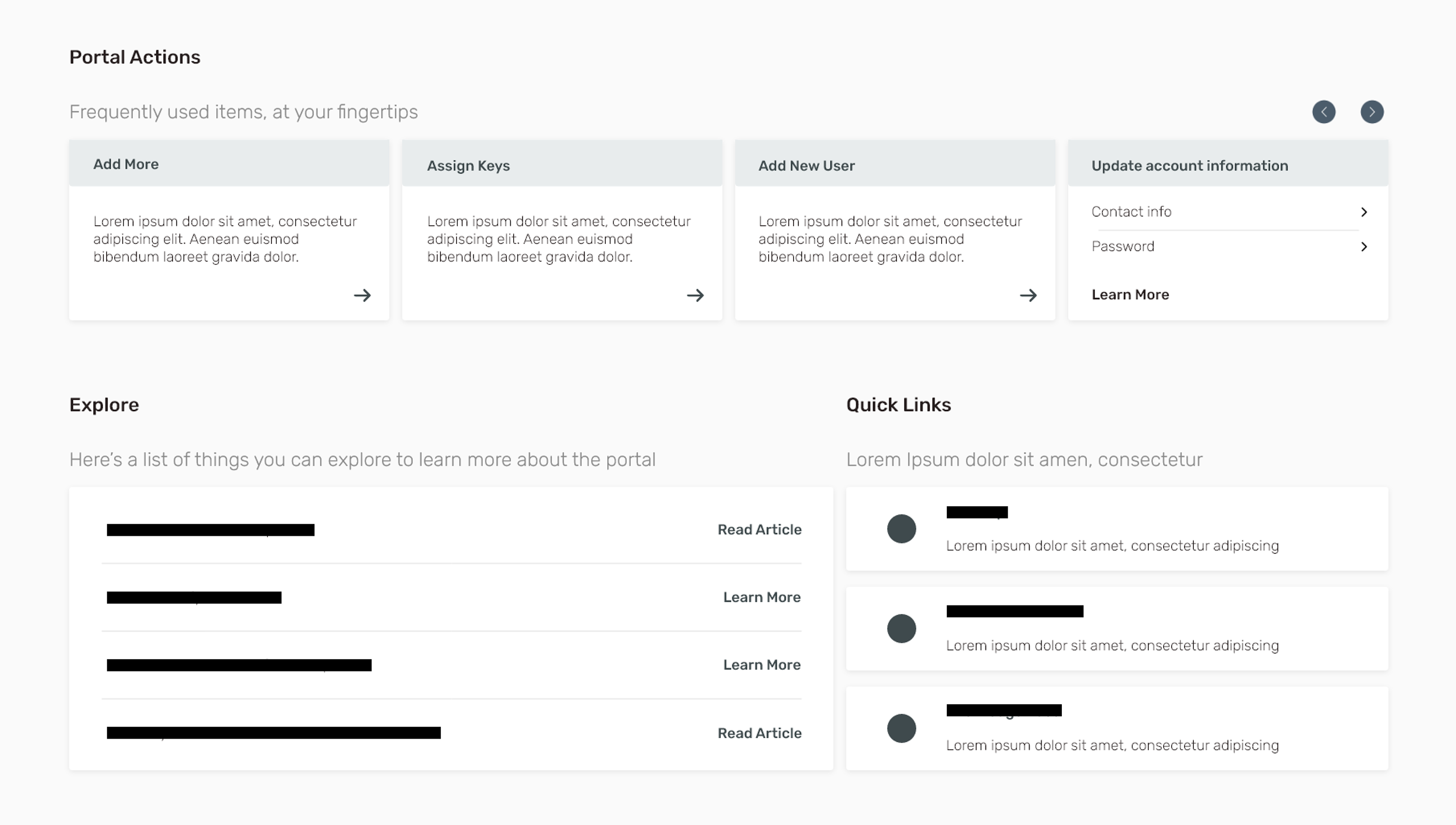
Tasks essential to the user based on the frequency of use. 2nd variant of the card contains 2 different actions for a particular task.
The banner acts as a separator as well as a space to feature various aspects of the product.
Highlights to the most active subscription (catering to the major scenario).
Quick links, learnings and community are other supporting aspects. As a limitation, no personalization could be implemented due to feasibility concerns.
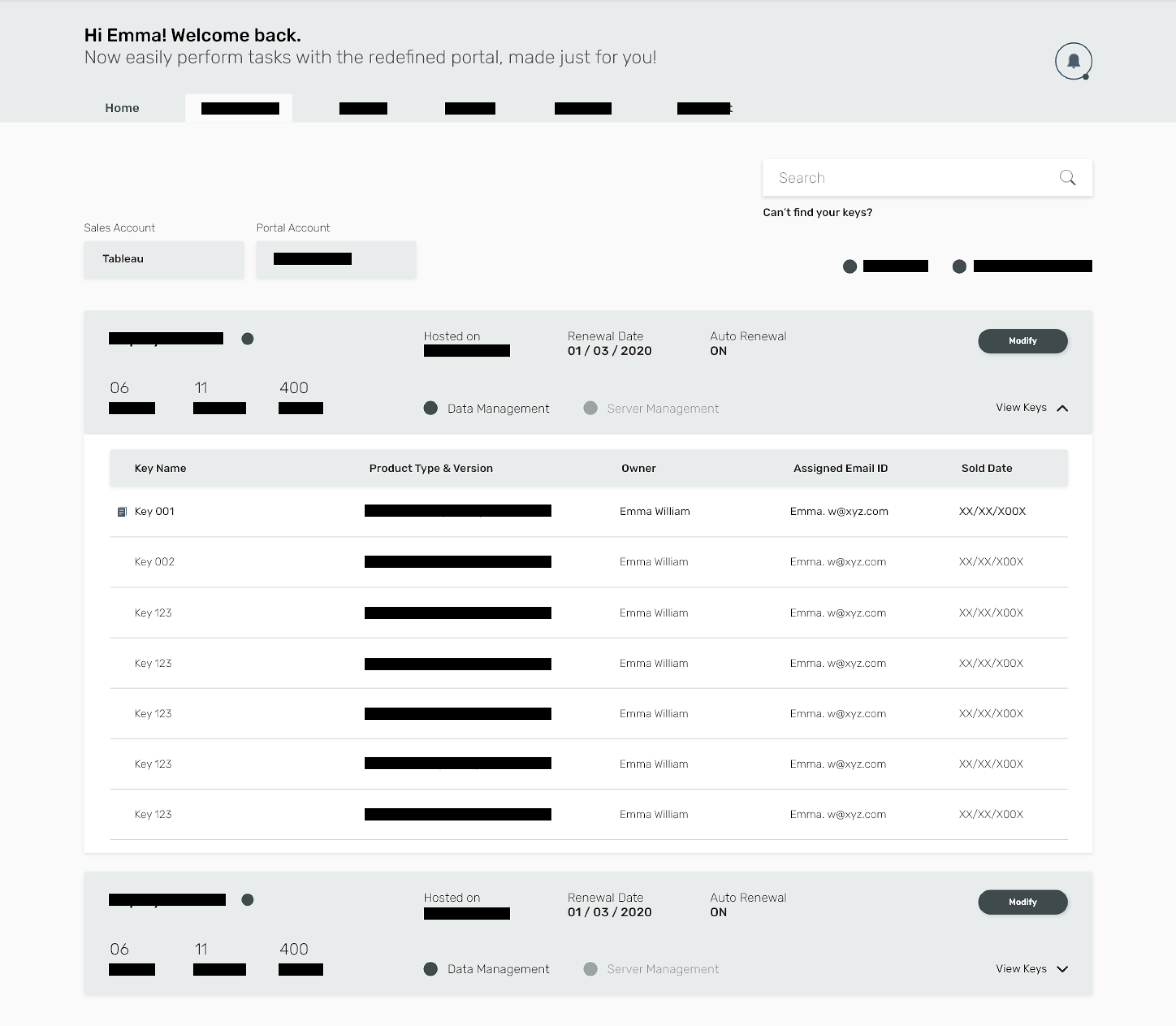
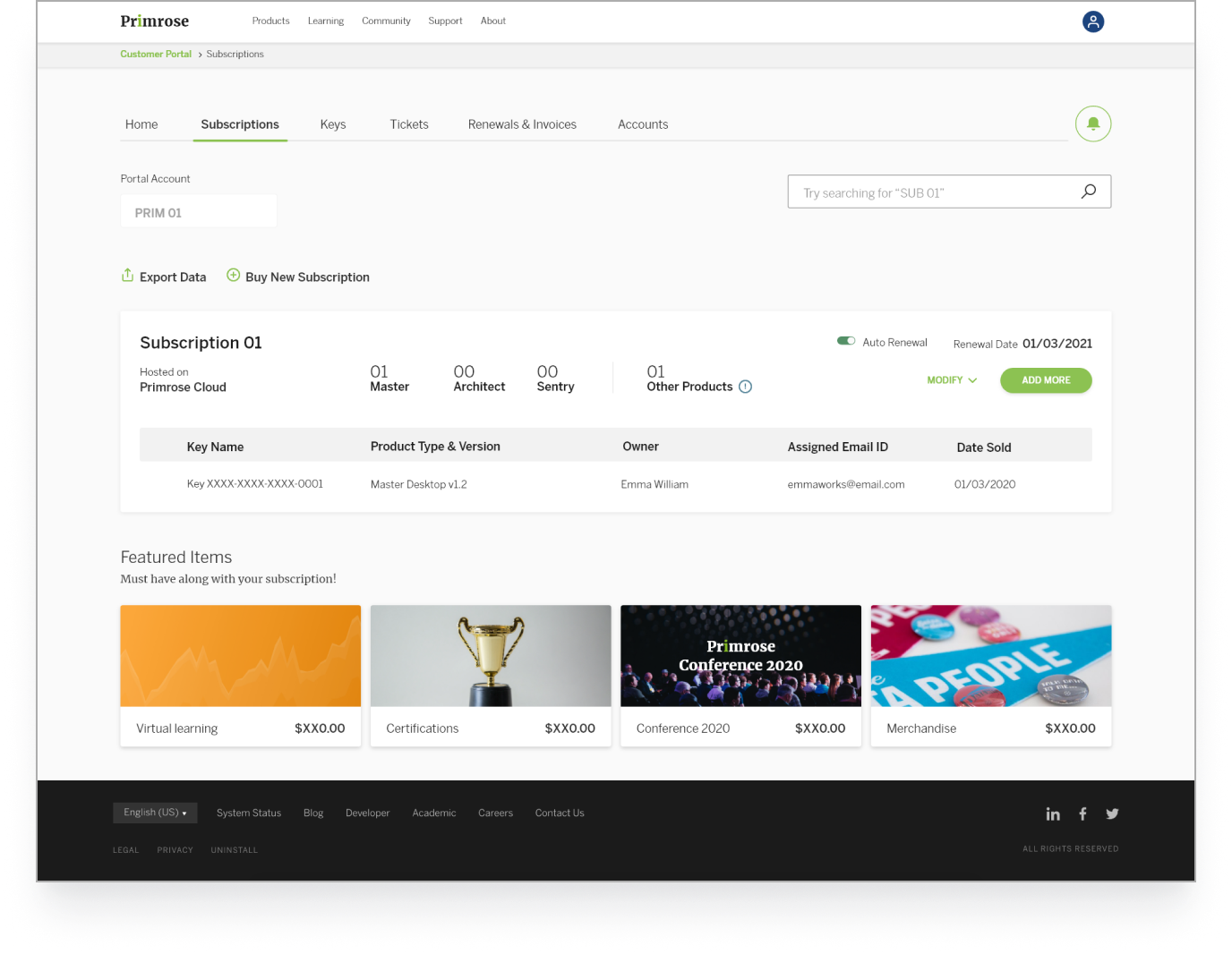
SUBSCRIPTIONS
Small-scale businesses utilizing a single subscription; can also contain multiple keys.
Featuring essential/good-to-have offerings to level up their product experience.
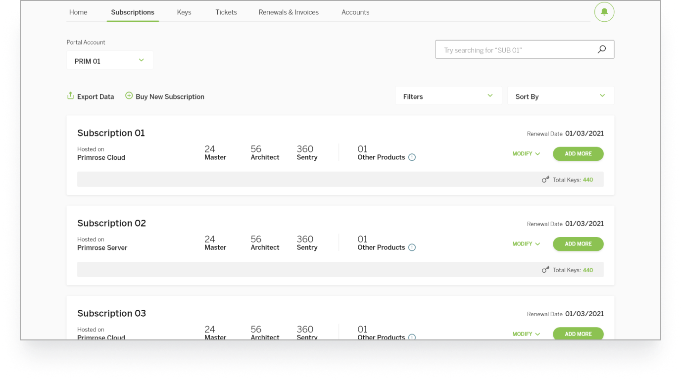
Enterprise business managing multiple accounts and subscriptions.
Additional features like filters and sorting were necessary for this use-case. (Minority)
PRODUCT COMPANION
Manage notification preferences without dwelling too deep into the settings.
All things profile in a lightweight format with minimal customisation features.
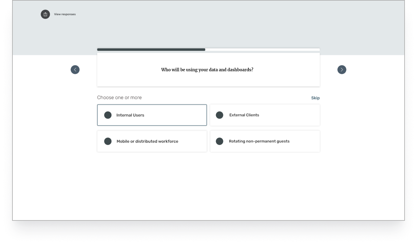
Recommendations vs. manual customizations to the results.
Intuitive presets to help them pinpoint their requirements.
Additional offerings by Primrose can be an essential asset to expose to the users.
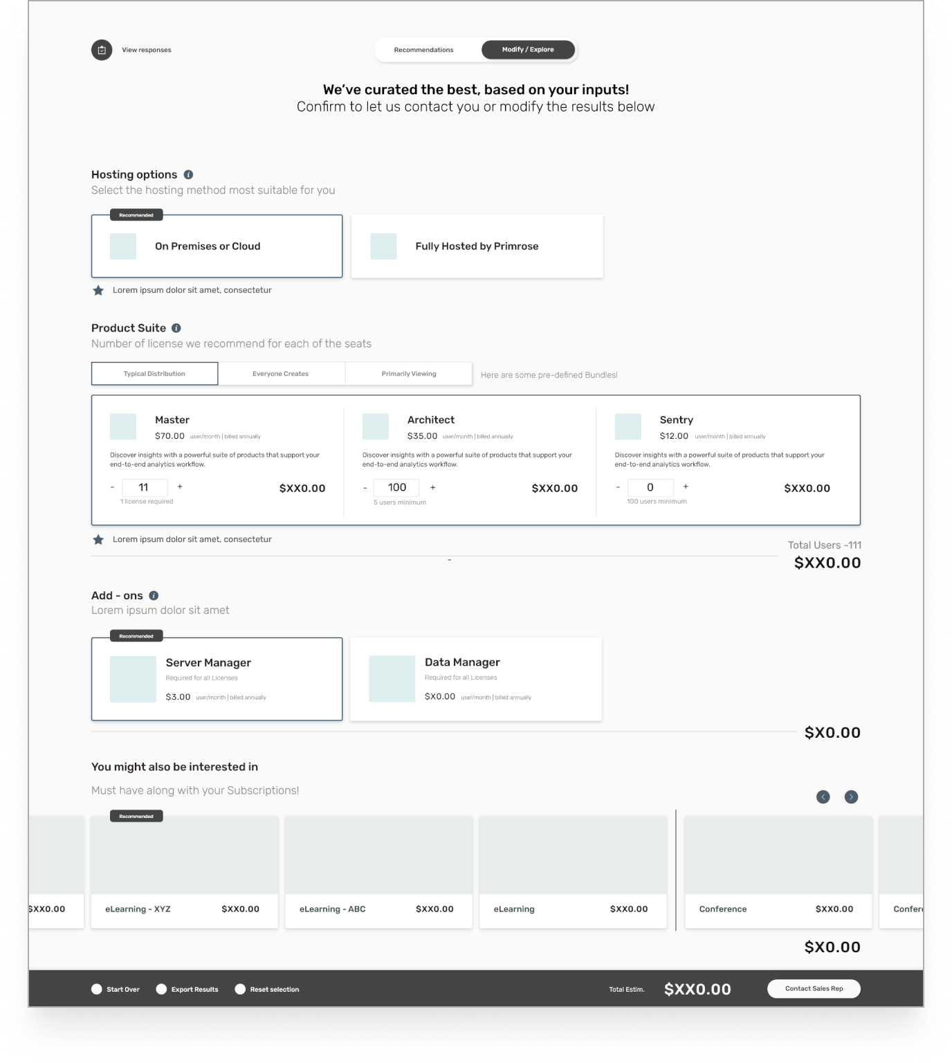
Quick way to head back to questions and edit responses for a different result.

PREVIEW/DEMO
WHAT'S NEXT
PROSPECT TOPICS
The phase may have ended with a feasibility first outcome but additional time was spent to share a vision for a seamless digital customer experience (under NDA). Included the following:
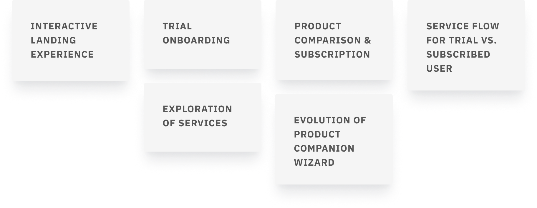
FUTURE VISION
 EMAIL
EMAIL LINKEDIN
 INSTAGRAM
 MORE PROJECTS